 KOREAN
 ENGLISH
Copyright 2021 KYERYONG. All Rights reverved.
Copyright 2021 KYERYONG. All Rights reverved.
The symbol mark and logo that we currently use were made in 1978 to create Kyeryong’s original image and have been used for over 30 years. They are used in various fields such as apartments, induction signs of commercial buildings and many promotion media as the face and representative of Kyeryong Construction Industrial.
The mark of Kyeryong Construction Industrial, which is the same symbol in the multilateral business fields, is repeated continuously to create the ascending image and to sublime to the level that all company members are equipped with new values and behavioral patterns, so it plays a core role in affirming the company image. Especially, the signs of Kyeryong installed in each field become an important means to promote the development aspect that spreads nationwide.
It symbolizes perfectness and infinity. It expresses the willpower to pursue infinite development, profound harmony and perfectness.
It is a representative shape of Korea. The geometric pattern shows the basic awareness that Kyeryong exists in the big boundary of the nation as a Korean company and the pursuit of development of the company and the nation at the same time.
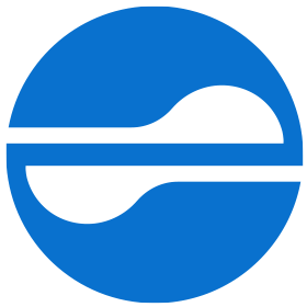
The mark of Kyeryong Construction Industrial consisting of the combination of the circle and Taegeuk pattern was made based on the consonants and vowels of Kyeryong in Korean. In other words, it is the pattern from ‘ㄱ’ of Kye and ‘ㄹ’ of Ryong. In addition, the white part is the shovel shape, which expresses the working spirit and pioneering spirit of Kyeryong.